Four Seasons

Red, White, and Blue Designer Dressing Without Costume

Red white and blue designer dressing edited through midnight ivory and garnet tones for THE NOTICE by THE GRAY CRAB

Red, white, and blue is one of the easiest colour combinations to recognize and one of the hardest to wear with restraint. The problem is not the palette itself. The problem is that the three colours arrive with so much cultural memory that the clothes can become symbolic before they become elegant.

The better approach is to treat the palette as a composition problem. One colour carries the structure, one supports it, and one appears as pressure. When all three compete at equal volume, the result becomes themed. When they are given different jobs, the same palette can feel urbane, relaxed, or quietly ceremonial.

The challenge is hierarchy, not patriotism

Strong colour combinations need unequal weight. A navy jacket over an ivory trouser with an oxblood bag works because the eye knows where to settle. A bright red jacket, royal-blue trouser, and optical-white shoe give every element the same authority and leave the wearer with none.

Begin by deciding which colour should occupy the largest visual field. For most wardrobes, that will be navy, ink, white, ivory, or denim. The remaining colours should be introduced through a shirt, scarf, shoe, bag, belt, jewellery detail, or controlled layer.

This is the governing rule: the palette should support the person before it announces the occasion.

White is architecture

White creates the breathing room that makes red and blue wearable together. It can appear as a shirt, trouser, dress, knit, sneaker, leather bag, or the negative space between stronger colours. Its job is to separate and clarify.

Optical white is crisp and graphic. Ivory, chalk, cream, and warm white soften the contrast and usually feel easier beside navy, denim, suede, raffia, and brown leather. The choice should follow the material and the room. A sharply pressed white poplin shirt can carry city tailoring. An ivory linen trouser belongs more naturally to summer travel or a terrace dinner.

White is strongest when the fabric gives it depth. Cotton poplin, linen, silk, textured knitwear, and substantial leather prevent the colour from reading as empty or clinical.

Blue should carry authority

Blue has the widest range in the palette. Navy and midnight can perform almost as neutrals. Ink blue adds depth without the hardness of black. Denim introduces informality. Muted cobalt can work as an accent when the surrounding clothes remain quiet.

For a city look, let navy do the structural work through a blazer, trouser, coat, or bag. For resort dressing, a blue linen shirt or cotton knit can carry the same role with less formality. For evening, midnight works especially well because it absorbs light more softly than bright blue while retaining distinction from black.

THE GRAY CRAB colour psychology is clear here: midnight and sapphire should communicate trust, calm, intelligence, and composure. They should not drift into tech blue or decorative royal blue without a reason.

Red should be pressure, not volume

Red becomes more sophisticated as it deepens. Garnet, oxblood, burgundy, and dark cherry have more range than a bright flag red because they carry warmth without flattening the rest of the wardrobe.

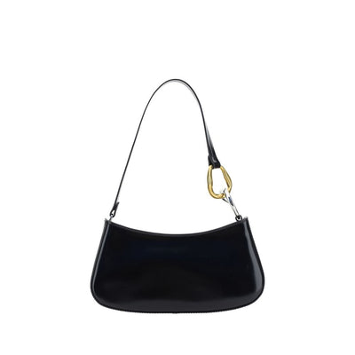
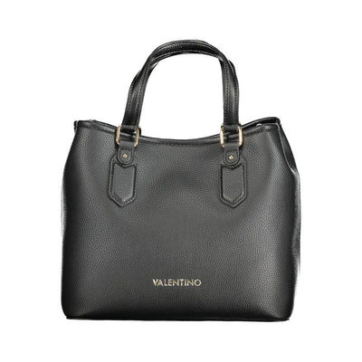
A red accent can live in a leather loafer, handbag, scarf, belt, stone, enamel detail, or narrow knit. It can also appear in one garment if the rest of the outfit becomes deliberately quieter. A garnet dress with black accessories is a different proposition from red trousers worn with a blue jacket and white shoe. The first has a focal point. The second has a theme.

For affection, celebration, and occasion, garnet or oxblood can carry the emotional signal without sacrificing the house language.

Material keeps the palette adult

The fastest way to make red, white, and blue feel literal is to render all three colours in flat, equally saturated surfaces. Material interrupts that effect.

Linen makes white and blue more atmospheric. Suede makes burgundy or oxblood quieter. Denim lowers the formality of blue. Silk can make a small red or blue accent feel deliberate near the face. Raffia and natural leather introduce warm texture that prevents the palette from becoming graphic.

Consider the surface before the colour name. A muted red suede shoe behaves differently from a bright red patent shoe. A navy hopsack jacket behaves differently from a shiny navy synthetic. Material decides whether colour feels lived in or applied.

Three rooms, three versions

City lunch: navy blazer, ivory trouser, white shirt, dark brown or oxblood loafer. The red exists only at the foot. The outfit reads as tailoring first.

Coastal weekend: white or ecru linen, washed blue shirt, tan sandal or espadrille, with a deep-red scarf or small leather accessory if colour is needed. Texture carries more of the work than contrast.

Summer evening: midnight dress or dark tailoring, silver jewellery, white or ivory detail, and one garnet accent. The palette becomes more formal because the colours deepen and the shine is controlled.

The point is not to reproduce these combinations exactly. It is to see how the same three-colour idea changes when proportion, fabric, and room change.

Where the palette usually fails

Equal saturation is the first failure. The second is literal motif: stars, stripes, flag-like blocking, or multiple thematic accessories. The third is over-coordination, where shoes, bag, belt, scarf, and jewellery all repeat the same three colours.

Another common failure is ignoring undertone. A warm ivory can sit beautifully beside oxblood and navy, while a hard optical white may make the same combination feel sharper and more graphic. Neither is wrong, but they create different rooms.

Finally, avoid using colour to rescue weak clothes. A poorly cut blazer does not become more convincing because it is navy. A weak red bag remains weak. Curation comes before colour.

Buy into the palette in the right order

If the wardrobe does not already support red, white, and blue, buy the neutral architecture first. Start with navy, midnight, white, ivory, denim, charcoal, and natural leather. Add deeper red only when there is already somewhere for it to land.

This order matters commercially and visually. The most useful purchase is the one that can survive after the holiday, event, or seasonal association has passed.

Shop the colour note

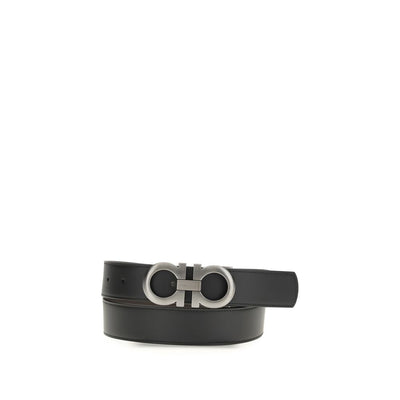
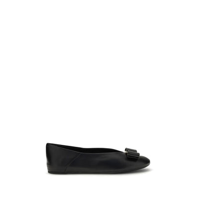
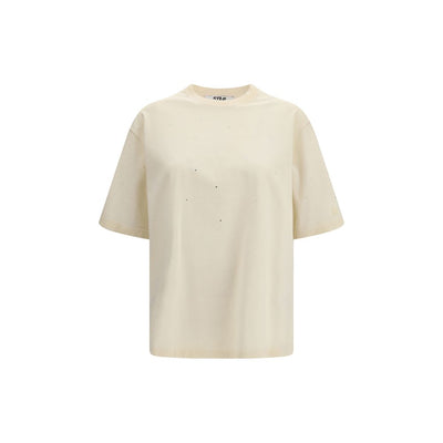
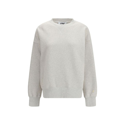
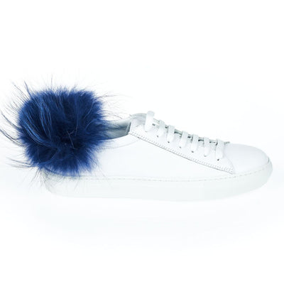
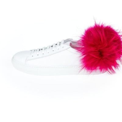
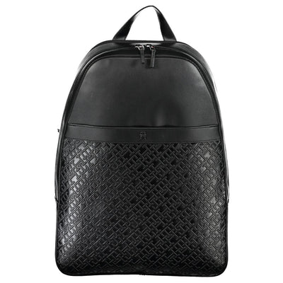
Build the palette through men's clothing, women's clothing, men's shoes, women's shoes, and accessories at THE GRAY CRAB.

THE GRAY CRAB view

Red, white, and blue does not need to be avoided. It needs to be edited. White creates space, blue carries authority, and red supplies the emotional pressure. When material and proportion remain in control, the palette stops looking thematic and starts looking intentional.